
Professional responsive web design that creates modern, mobile-friendly websites that work seamlessly across smartphones, tablets, laptops, and desktop computers.
A responsive website automatically adapts to different screen sizes and devices, giving visitors a smooth and professional browsing experience whether they are using a smartphone, tablet, laptop, or desktop computer.
Our responsive web design service focuses on creating websites with flexible layouts, easy navigation, readable content, optimized images, and user-friendly interfaces that work consistently across modern devices and browsers.
From business websites and corporate platforms to service websites and online portfolios, we build responsive experiences that look professional, perform efficiently, and help your visitors find the information they need quickly.
Choose the package that best fits your business needs. All packages are designed to deliver a professional and responsive website experience across different devices.
For individuals and small businesses
For growing businesses and brands
For advanced business requirements
Pricing may vary depending on project requirements and functionality. By proceeding, you agree to our Terms of Service and Privacy Policy .
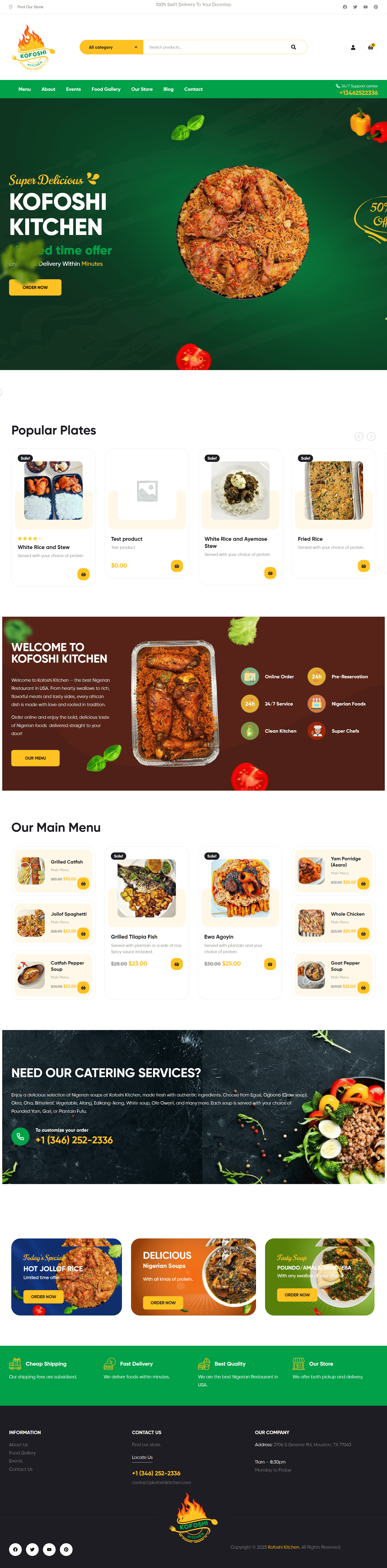
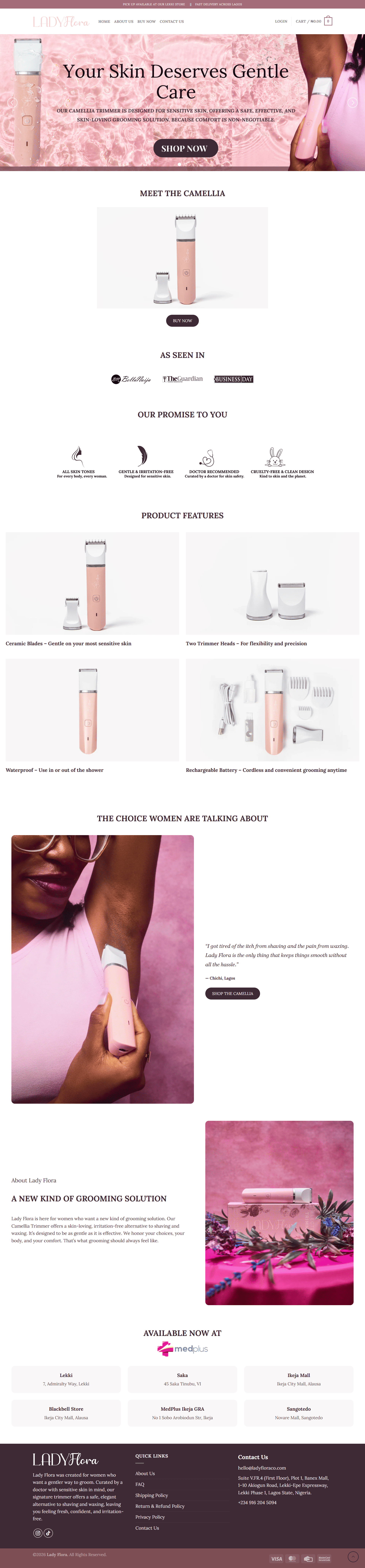
Explore examples of websites designed to provide a smooth and professional experience across different screen sizes and devices.

Find answers to common questions about responsive websites, mobile optimization, pricing, development, and support.